
Brand Kit · Northbound
A brand built to give direction to complexity.
These are the official materials for representing Northbound consistently — symbol, colors, typography, imagery and application principles.
01 · Brand
Northbound points toward the right direction.
The symbol is the brand's recognition element. Preserve its proportions, use high contrast and leave enough clear space around it.
 Transparent PNG available
 Transparent PNG available
The symbol is the original file. The lockups are transparent PNG exports of the composition used on this site. No vector version is included.
02 · Design system
Depth, clarity and one interaction blue.
The foundation combines deep navy, stepped surfaces and editorial contrast. Northbound blue guides focus, selection and action.
Background
TokenDark themeoklch(0.212 0.026 259)
Light themeoklch(0.985 0.003 250)
Northbound Blue
TokenDark themeoklch(0.66 0.17 256)
Light themeoklch(0.52 0.16 256)
Surface
TokenDark themeoklch(0.242 0.028 259)
Light themeoklch(0.985 0.003 250)
Surface Raised
TokenDark themeoklch(0.278 0.031 259)
Light themeoklch(1 0 0)
Foreground
TokenDark themeoklch(0.975 0.005 250)
Light themeoklch(0.129 0.042 264.695)
Muted
TokenDark themeoklch(0.79 0.024 255)
Light themeoklch(0.554 0.046 257.417)
Green, amber and red are reserved exclusively for status and alerts.
03 · Typography
Hierarchy through scale, weight and space.
Space Grotesk gives ideas presence. Inter keeps body copy and interfaces precise, legible and understated.
Aa 0123
Aa 0123
04 · Banners and images
Territory, direction and real systems.
This selection brings together the backgrounds and images already approved across Northbound's digital presence. Use expansive framing and preserve the main subject.
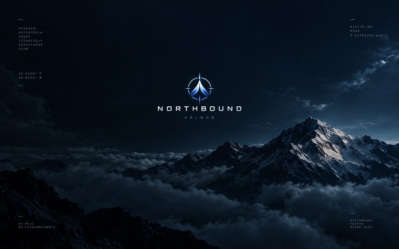
Territory 01
16:9
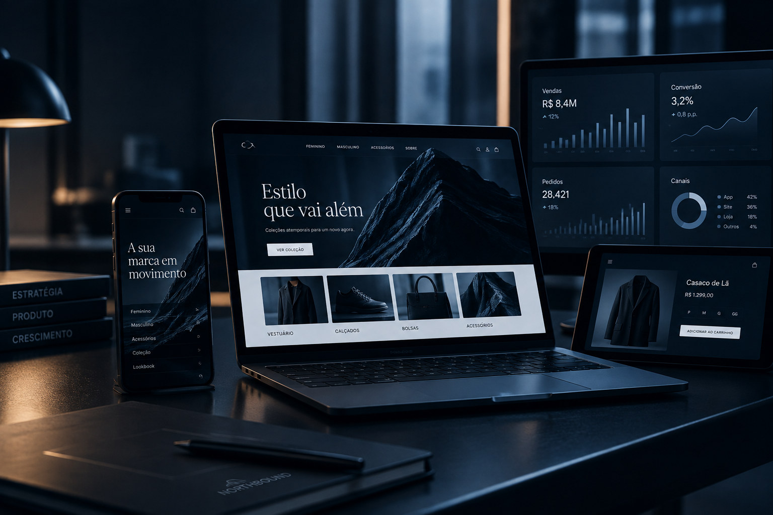
Territory 02
16:9
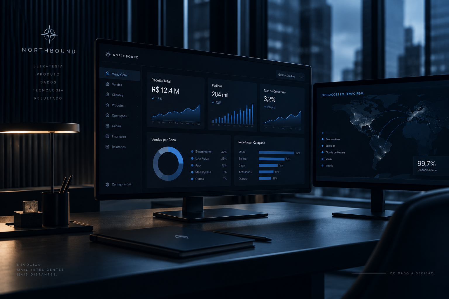
Territory 03
16:9
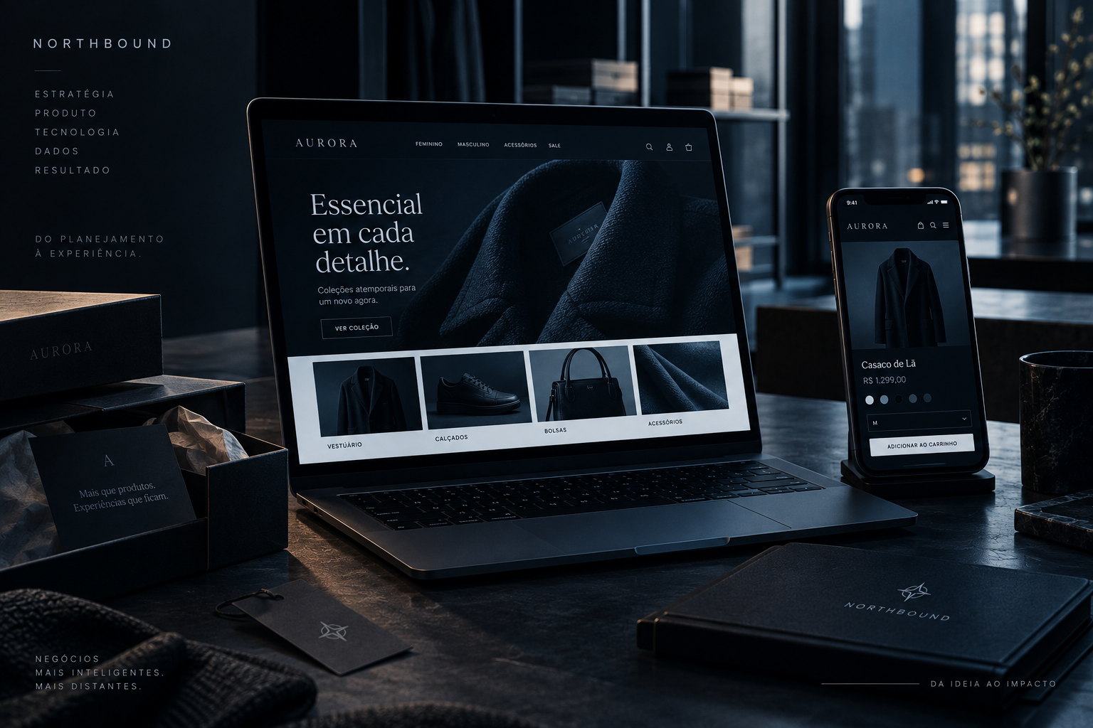
Territory 04
16:9
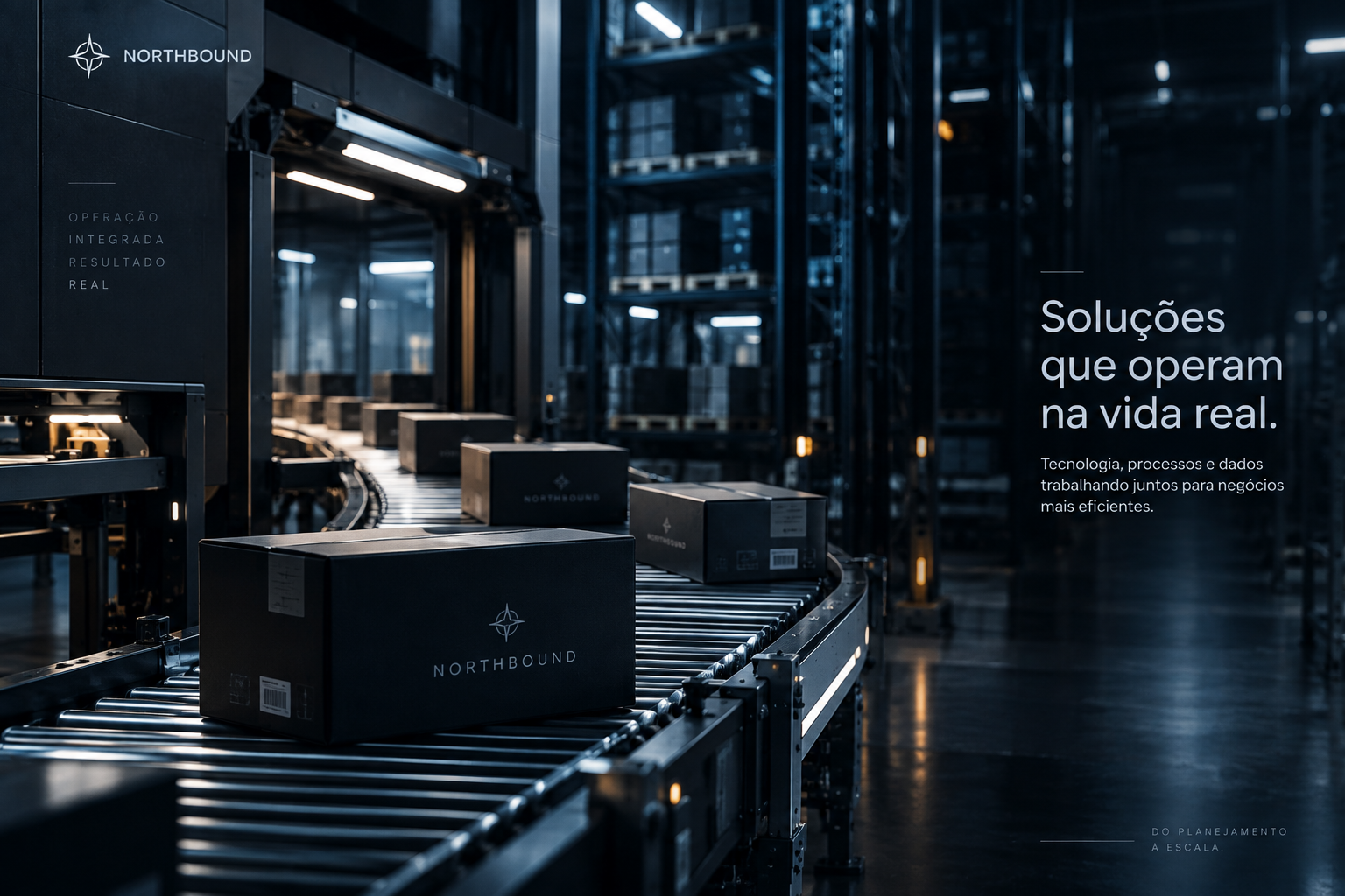
Territory 05
16:9

Direction
3:2
05 · Application
Less decoration. More intent.
The identity should feel editorial, precise and carefully built — never a generic visual layer applied to any content.
Do
- Use generous negative space
- Work with editorial grids
- Keep headlines strong and copy contained
- Preserve contrast and hierarchy
Avoid
- Distort or rotate the symbol
- Overuse glows and gradients
- Nest cards inside cards
- Adopt generic SaaS aesthetics
Downloads
Everything you need, in one package.
The file includes the official symbol, all images on this page and a guide to colors, typography and application principles.
Version 1.0 · September 2026